Color Picking
Added 2023-04-01 15:01:00 +0000 UTCThis time I wanted to touch a bit more on Colors!
I guess it's the most fun for most of the people because they turn the Linework into something you can actually grasp.
I do not color pick like the majority of people, because I work with Layer Options, but my artworks are still colorful, so I wanted to show you some tricks to get a few ideas for your future projects.
I talked a bit about overall color theory and how I actually work in my '22 Inktober already. You can read everything there!
Just a quick rundown how I work:
· Flatcolors
· Ambient light (e.g sky, light bouncing)
· Direct light source (Neon lights, fire etc.)
Flatcolors:
I work with CSP, so I can create collections for Flatcolors!
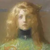
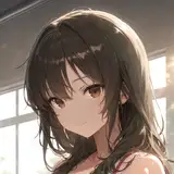
I picked them by getting a anime screenshot in natural lighting.

(you can download this image and use the pipette for the flatcolors (I use) for Dabi and Hawks!)
Ambient light:
When I talk about this, I mean the overall color of the environment. I put multiple Layers (usually on Overlay, Softlight or both) over the entire artwork to achieve the light conditions I envisioned.)
For most of the time there's at least one gradient and 2-4 different Layers stacked on each other. It's trial and error for the most part - but I find doing it this way gives me a lot of unintended, beautiful and interesting color combinations!

In CSP you have a specific Gradient Tool, but you can do it the old fashioned way and blur two different colors together!
As you can see, everything is tinted in the colors of the sky. But this would be the same case for e.g light bouncing off walls when RGB LEDs are in the room!
It's not as bright as direct light, but still there.
It doesn't matter at this stage how bright or dark the image is, for me personally, because I can adjust the light levels anytime.
Direct light source:
What I mean by that is simply something that is illuminating the object itself directly. This can be bright sunlight, neon street signs or a candle!
I usually put a layer with it's color directly over the flatcolor layer on Hard Light.
__________
Ok - but how do I pick colors or come up with a color scheme in the first place?
Answer: Inspiration and references!
You can do it by using color theory of course - complementary colors and stuff, but to actually get over the first step you need an idea.
I like to scroll through Pinterest or Instagram, esp. urban street photography has many nice colors. It doesn't matter the subject itself. All you need to know is how to break down different colors and the environment they're in.
What I like to do is pixelate the images I like heavily to get the overall color scheme!
This can be useful for finding flatcolors in general too (e.g color of architecture)

Pixelating images allow your eyes to just see the colors and not the details itself. You can do it stronger or weaker, whatever works best for you, it's just to get an idea in what colors the image breaks into.
Esp. with Geten (3rd) you see a nice gradient from yellow/rose to dark blue.
This is where actual color theory comes in handy - but there are a lot of other great sources that explains this kind of stuff on the internet already.
I usually rely on complementary and neighboring colors. Don't be afraid to mix some weird colors together though! Sometimes I get really nice results even if it was technically all a big accident haha!