DoujinStars
stereoscopecomics
stereoscopecomics

patreon


Page 44 & 45 updated!

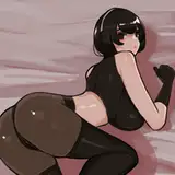
I'm pretty sure I've said it before, but the input I get from all of you is like a cheat code. A few of you pointed out that I'd forgotten the leash in multiple panels and that the chair didn't look particularly safe. I've made the fixes and I'm very pleased with the results. I also have two different versions of page 45 with the updated panel 1. I added some action lines as well as a fish-eyed lens filter to one of them. I'm not sure how I feel about it. I think I like it, but I'm not sure. Let me know your thoughts.

Thanks for help help!

Page 44 & 45 updated! Page 44 & 45 updated! Page 44 & 45 updated!

Comments

The "fisheye" effect works for me. Don't hesitate to distort reality a bit, if it helps convey an emotional reaction!

Shrub Jump

oh yeah, there's definitely a few lines not to be crossed. I can go to guys for thoughts and comments about what works better in a panel or page composition, whether a payoff packs a punch or not, and I can usually count on you guys to point out bad spelling, grammar, and inconsistantcies (like a leash that's suddenly disappears). ^^; What I can't go to you for is storylines, punchlines, dialogue, character development, etc. (although I may get inspired by comments and questions).

Stereoscope Comics

Fish eye works Really well also give instant vine boom realisation on her face

WritersBlock

Criticizing something you care about is awkward, and doing it in a public forum is even more so. There aren't many upsides, and you risk being branded a public enemy. It's also difficult to steer clear of that elusive red line beyond with "helpful" turns into "obnoxious". Then again, this is a community that prides itself on honesty and trust, so, as the saying goes - "if you see something - say something". ;) Thanks for the kind words. I really like the improved design. With regard to the fisheye effect - I'm gonna abstain. Both versions have their merits.

Amber7

I prefer the non-fisheye version personally - I like how it makes Ellie seem small while showing more of the hardware

Cass

I like the fish-eye! It's adds the right, 'gulp' vibe to that panel, imho

FoggyKernel

I like how the chair is comparatively more secure. Bolster down to the floor like that, it looks safer overall.

Jordan Andrew Scherr

I kinda like the fish-eye view, it demonstrates the shock on Ellie's face really well. I'm glad that our comments and feedback help you out, kinda makes the comic feel more personal. Keep up the fantastic work, and don't forget get to get some rest in as well.

Nick

I don't like the fish-eye it kinda detracts from the fun reveal of what kind of chair she sat in without realizing.

DoctorHam

I'm very glad that our feedback is helping, and it's nice to see it going into effect.

Katt Wallingford

Fisheye effect is cool, gives an interesting camera angle to the panel. Only downside is that you don’t see the rest of the chair.

IAmMalenia

The leash is a good add. I personally don't care for the fish eye effect. It kinda takes me out of the scene.

Tony Campbell

I kinda like it without the zoom in effect, we can see the chair better that way.

Death of Ink

45 Looks soo much better. It's amazing how much scope and detail a zoom out can add.

Brad Kitts

I like the fisheye effect.

Cheshire Noir

Personally, I like the version that shows more of the chair. It gives more details and because she's smaller in the frame, it communicates how vulnerable and scared she is.

PiLambdaOd


More Creators