☆ Art Process ☆
Added 2020-11-05 11:20:27 +0000 UTC
☆ Sketch ☆
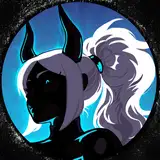
I wanted to give these redraws a more art nouveau kind of feel (mainly changing the hair to make it more curled). And also add more refined background elements, making them different and relevant for each Goddess. Nyx, obviously being the Mother of Night has a structured door arch and will have a night sky scene in it.

☆ Line Art ☆
I think line art is my favorite part of the process.
I use the calligraphy brush slightly modified to be the same width at both ends, this gives me a lot more control over what thickness the lines are going to be.
I also try to stick to that thickness for the whole of the drawing (par little features like the face). Hence the little 47 note in the corner to help me remember what thickness I'm using.

☆ Flat Colours ☆
Next is filling it in with flat colours - I used a slightly modified gel pen brush for colouring.
I tend to find this part the most tedious, but its always nice to have line art to colour when you're not feeling very creative I suppose. I used the base colours from my previous Nyx illustration to start.
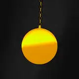
The gold base is always a present 5 colours I have saved and then I up the saturation to achieve a more gold touch. This is probably the ugliest part of the process in my opinion.

☆ Shadows ☆
I then add shadows in 2-3 darker colours of the same shade wherever I think they'll look best.
I once read that you should've just put shadows along lines, and should think about where the light is actually hitting objects and casting shadows - but that's dull to me. I tend to just follow lines and where I think a piece will be darker or lighter. Or try to draw more attention to one place by making it lighter in contrast to the rest.
As you can probably gather, my colour theory is veeeeery weak. I am now thinking about changing some details, inspired by @denaseey (twitter). I have been loving how they use completely opposite, and bright neon colours to accent their pieces.

☆ Highlights ☆
Adding highlights is probably one of my favorite things to do.
I set a layer to 'add' and with my white colour brush I add little curves and edges to try and give some illusion of light. I got this idea from the Madoka Magica series, which if you look they have the same kind of swirl/curve highlight over the top of their head.

☆ Finale ☆
Then finally I set the lineart layers to alpha lock and colour them in with darker colours. The way I choose which lines to colour took a long time to figure out, but I tend to follow the rule of: if it is a barrier to other objects/colours I leave it black.
I do like how this redo came out a lot, I still think it needs tweaking a little bit as I finished off late one night and just wanted it done. I'd also like to experiment with adding neon accents as I mentioned before also.