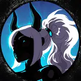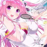
☆ Artemis Art Process ☆
Added 2020-11-09 21:05:27 +0000 UTC
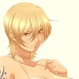
Hello! Here is the new process walk through of my second redo of my Hades Goddess series.
☆ Sketch ☆
I wasn't really happy with my original Artemis piece, she looked a bit stiff. And I think it was annoying me that I didn't have her shooting. As I mentioned before, I wanted their hair to be more Art Nouveau - as Artemis has her hair in a braid I wasn't quite sure how to approach this. But, having the strands coming out of the braid, and wrapping around at the bottom looks nice.
I tried to use a reference to get a clear idea of how someone would shoot a bow & arrow but I didn't find anything super helpful so worked out my own idea. I don't think it's super fluid but will do for this.
Super useful when sketching, for me at least, to use different colours to outline different parts - especially if they overlap. I think my sketch process is pretty messy anyway so this helps.

☆ Line Art ☆
Again, my favourite part - everything looks so clean and defined at this stage, I love it.
Moving on from my Nyx piece, I had learned what I wanted to be brought through to these pieces. I wanted them all to have an aspect of their selves mirrored in the background shape. For Artemis I chose a "wood/tree" and the birds she's drawn with in the game art.
Here I want to mention something that really helped me take a step forward when lining. For me at least its so important now to have line breaks. It makes the image look a lot more interesting and makes the eye move. I used to not include these little dots, and make my lines connect thinking it was somehow cheating?
But sometimes when I stare at line art for two long I can make my eyes only focus on the dots - that's kinda cool.

☆ Flat Colours ☆
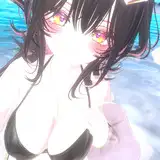
I don't really use green a lot, I think it looks super cool with purple in poison themed drawings, and with Miss Isley but apart from that...nah - pink's more my vibe.
I don't have a lot to say about the flat colour process as its just using colours similar to the game art - so I didn't even pick my own colour palette. I will just add that the hue/saturation change tool is soooooooo useful. Please use.

☆ Shadows ☆
Oh I will just say, here I did colour the tree and bird in full colour, then decided that was too much to look at, and wouldn't match Nyx's background. You'll see in next step I scrapped them colour on this aspect.
Shadows are shadows - they're very boring to me now. I now where to put them to match my style and as stated before find it boring to use actual shadow/light dynamics and physics. I just always try and remember to make one side of the face darker, and line the underboob.

☆ Highlights ☆
Again, highlights are highlights.
Set that layer to 'add' and white it out.

☆ Finale ☆
Finished! Really like how it came out.
Definitely made the right decision to take out the colour on that tree and bird and just have the light lines.
I've also jus realised looking at this process that I left out her eye, target tattoo so I'll have to add that in before posting.