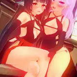
1. In Clip Studio, I draw rough thumbnail to get the basic concept down.
2. Rough sketch. I make a more formal sketch to work out the layout, pose, and proportions. I start getting some of the details roughed out. I decide to flip the layout for better left-to-right tension. I also sketched in a rough version of the final outfit.
3. Final sketch. I sketch the fine details for the character. I use separate layers in multiple folders for the various props and the character which makes it easier to plan, especially when so many of the parts overlap. If you look closely, you can see that I draw some parts that I know will be completely hidden behind others, particularly the basic body shape, to make sure it will all make sense together. Keeping them on separate layers also makes it easier to shift the positions of individual features when final details on foreground features might change the layout needs.
4. Inking. I scale the canvas up to four times the size and use a variable-width inking brush for the character and a constant-width brush for hard things on vector layers. I use lots of different layers for different parts, which makes it easier to overdraw and erase as needed. Planning for the line coloring later, I try to use a different vector layer for each part that would be differently colored as linework such as one each for the character's skin, one for everything that will have black linework, etc. I even extended or closed the linework to go well beyond the point at which I plan the opaque water to conceal it. I also inked the decorative stripes on the outfit although I will later convert those to parts of the color blocking instead of using them as linework.
5. Color blocking. I set the folder containing all the different inked vector layers as the reference layer. Then I made new raster layers underneath and started filling in the flat colors. Sometimes I used a round pen, sometimes the collor fill bucket, usually with the fill set to follow only the reference layer, stopping at the middle of a vector. I did a very rough, scribbly coloration for the rock, using simple round markers in colors sampled from a photo of a rock in the ocean.
6. I colorized each of the stripes in various colors and masked them to the parts of the color blocking to which they belong.
7. I used a scatterbrush to add some random darker smudges to give the shark fin a more organic, mottled texture. I used a watercolor brush to refine the details of the rock.
8. Form shading. I create a dark brown solid color layer (linear burn) and start painting in the basic form shading with a soft airbrush. I always start with shading at full and then use the airbush set to clear to paint away the shading, painting with light. For the hair, I used color burn for richer shading and start with a general, soft airbrush for the overall shape, then used a variable-width soft airbrush to smudge detail into the shadows, picking up the shape of the hairs. I also added a pale yellow layer set to screen to airbrush in some soft highlights in key places.
9. Cast shadows. I make a new brown layer set to multiply and start painting in the cast shadows with soft brush, using a smaller brush in places where the object casting the shadow is closer to the thing the shadow is on.
10. Backlight. On a new fill layer set to screen, I used a desaturate solid color painted with a soft airbrush in the mask. When I combine it with the form shading, backlighting really makes the characters pop. I don't use any backlight on non-reflective objects. For some objects, I only use a backlight on shadowed side. For the most reflective objects, I add a forelight on the primary light side as well. On the hair, I used the fingertip tool to streak in the shape of the hairs.
11. Shiny. I used fill layers of white (set to screen) and paint spots and streaks using a hard variable-width brush. For the satin, I also added a layer set to overlay and airbrush in white to add colorful glistening highlights. For hair shine, I used another raster layer set to overlay and painted thin strokes with a variable-width brush, then use an airbrush to add a soft glow to groups of streaks, then use a clear airbrush to fade the tops and bottoms of streak groups, and finally use a soft round brush to erase a few streaks in the middle of each group. After painting all the shine, I use the cast shadow layer to make a selection and delete the shine from anywhere covered by shadow.
12. For the natural blush, I add in a raster layer and airbrush red just on the skin for the cheeks and places where bone is near the surface of the skin. I use the same method to paint in the make-up.
13. Colored linework. Since the linework is still all vectors in Clip Studio, I simply selected the vectors and changed their color to whatever colored linework I needed, sampling from each section and then shifting the color to be more saturate and dark, more or less depending on how hard or soft I want each thing to feel. The hardest things I keep black. Then I collapsed all of the linework into raster layers, locked the pixel transparency, and used an eraser to fix up any places where different color linework crossed over each other or a multiply brush where the shadows were deep enough to require darker linework.
14. Eyelashes are done with a simple raster layer painted with a black variable-width pen. Then I lock the pixel transparency for that layer and use a soft pen to paint in grey streaks for texture and then soften the look with a few strokes of a black soft airbrush.
15. For the water, I switched over to Photoshop and used the fiber render filter plus the glass filter to make a wavy pattern, then turned it sideways and used perspective distortion to make it much wider at the bottom. I flattened that and then edited it into a horizontally tiling pattern and added a blue gradient to it. Then I save it out and imported it in Clip Studio as a new pattern which I scaled into the backdrop of the picture, cropping the mask at the horizon. Then I added masks to the layers containing the rock and characters and carefully masked out the bottoms of things where they went into the water.
16. For the water ripples, I used an airbush on a new layer, sampling various colors from the water, and stroked in some ripples, using a thumb smudge to smear the trailing edges of the ripples. Lastly, I used a very light blue and a spotty pen to stipple in just a little bit of seafoam here and there.
17. For the clouds, I used my simple cloud brush, which is just one little blob of cloud, that I sampled from a photo of clouds, with lots of angle jitter and scatter. I start by using the cloud brush to paint in the whole cloud shape using the darkest shade of the cloud. Then I lock the transparency of the layer (so that I can change the color of the pixels without affecting the shape) and switch to a medium color to paint the general form of the clouds. Then I did it again a little higher up using a pink color and a bright white color.