1. In Clip Studio, I draw rough thumbnail to get the basic concept down.
2. Rough sketch. I make a more formal sketch to finalize the layout and poses. I used Clip Studio's 3D models and perspective rulers as references and roughed in the general shapes for the clothing and props.
3. Final sketch. I use separate layers in multiple folders for the various props and the character which makes it easier to plan, especially when so many of the parts overlap. If you look closely, you can see that I draw some parts that I know will be completely hidden behind others, particularly the basic body shape, to make sure it will all make sense together. Keeping them on separate layers also makes it easier to shift the positions of individual features when final details on foreground features might change the layout needs.
4. Inking. I scale the canvas up to four times the size and use a variable-width inking brush for the character and a constant-width brush for hard things on vector layers. I use lots of different layers for different parts, which makes it easier to overdraw and erase as needed. Planning for the line coloring later, I try to use a different vector layer for each part that would be differently colored as linework such as one for the character's skin, one for everything that will have black linework, etc.
5. Color blocking. I set the folder containing all the different inked vector layers as the reference layer. Then I made new raster layers underneath and started filling in the flat colors. Sometimes I used a round pen, sometimes the color fill bucket, usually with the fill set to follow only the reference layer, stopping at the middle of a vector.
6. For the backdrop, I started the lawn with a block of solid green, then used my grass tuft brush (which I created for "Boombox Apology") using a mix of two other shades of green. Then I made a single fence post, turned it into a repeating pattern in white, then made a duplicate in a darker shade behind it, slightly offset, then added a very faint grungy texture to the whole fence. I painted a simple block color house in the distance. I used my foliage brush to add some trees in three shades of green. Then I heavily blurred the house and trees and mildly blurred the fence, to create depth. I used my cloud brush to paint some clouds in three shades. Then I added a layer of sky blue, fading out at the bottom, set to Hue blend mode, to tint everything in the distance in blue to bring it together. I also used the foliage brush to add a bush near Sissy's house and I stamped in a few flowers in the flowerbox and used a watercolor brush to add some leaves.
7. Form shading. I create dark solid color layers (brown for inside the house, blue for outside the house, set to linear burn) and start painting in the basic form shading with a soft airbrush. I always start with shading at full and then use the airbush set to clear to paint away the shading, painting with light. For the hair, I used color burn for richer shading and start with a general, soft watercolor brush to get lay in some stronger hairs for a sense of texture, then use an airbrush to establish the overall form, then use a fingertip smudge to add some extra detail. For the more chiseled parts, I used a different shading technique. starting with a hard brush to make something like cel shading, then using watercolor brushes to add midtones, then using the blur tool to smooth the shading out where appropriate. I set the opacity of the shading lower outside and higher inside.
8. Cast shadows. I make a new dark layer (blue inside the house, brown outside the house) set to multiply and start painting in the cast shadows with soft brush, using a smaller brush in places where the object casting the shadow is closer to the thing the shadow is on. I set the opacity of the shading lower outside and higher inside.
9. Backlight. For the secondary lights, I used a desaturate color layer away from the light source and a white layer toward the light source, both set to screen. Then I paint with a soft airbrush on opposite sides of shiny objects. The forelight is used only on the shiniest parts, mainly the decorations. When I combine it with the form shading, backlighting really makes the characters pop. I don't use any backlight on non-reflective objects. On the hair, I used the fingertip tool to streak in the shape of the hairs.
10. Shiny. For the glossiest parts, I used light watercolor brushes to paint reflections for both primary and reflected light sources, then I used a strong watercolor brush for the specular highlights, using a thumb tool to smudge for detail. For the shine on the hair, I started with thin strokes with a soft watercolor brush, then use an airbrush to add a soft glow to groups of streaks, and finally use a soft round brush to erase a few streaks in the middle of each group. I also added a pale yellow layer set to screen to airbrush in some soft highlights in key places. After painting all the shine, I use the cast shadow layer to make a selection and delete the shine from anywhere covered by shadow.
11. I added textures to the wallpaper, carpet, sidewalk, panelling, and ledge, using distortion to match the perspective in each area.
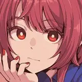
12. For the natural blush, I add in a raster layer and airbrush red just on the skin for the cheeks and places where bone is near the surface of the skin. I used the same approach for make-up.
13. Colored linework. Since the linework is still all vectors in Clip Studio, I simply selected the vectors and changed their color to whatever colored linework I needed, sampling from each section and then shifting the color to be more saturate and dark, more or less depending on how hard or soft I want each thing to feel. The hardest things I keep black. Then I collapsed all of the linework into raster layers, locked the pixel transparency, and used an eraser to fix up any places where different color linework crossed over each other or a multiply brush where the shadows were deep enough to require darker linework.
14. Eyelashes are done with a simple raster layer painted with a black variable-width pen. Then I lock the pixel transparency for that layer and use a soft pen to paint in grey streaks for texture and then soften the look with a few strokes of a black soft airbrush. I also added a little color to the tips of the lashes to make them extra fancy.
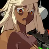
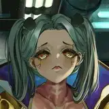
15. For the sweat, I started with colored lines just a little bit lighter than the skin it is on when it close to the skin or white when it on the eyes or dripping off. Then I filled them with low-opacity white. Then I added some cast shadow, then secondary lights in reverse direction for the rest of the scene, then white specular highlights with a hard brush.
16. Finally, I made a copy of the completed foreground image, then used the thumb tool to add some motion streaks in a few key places.