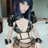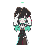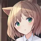
1. In Clip Studio, I draw rough thumbnail to get the basic concept down.
2. Rough sketch. I make a more formal sketch to finalize the layout and poses. I used Clip Studio's 3D models and perspective rulers as references and roughed in the general shapes for the clothing and props.
3. Final sketch. I use separate layers in multiple folders for the various props and the character which makes it easier to plan, especially when so many of the parts overlap. If you look closely, you can see that I draw some parts that I know will be completely hidden behind others, particularly the basic body shape, to make sure it will all make sense together. Keeping them on separate layers also makes it easier to shift the positions of individual features when final details on foreground features might change the layout needs.
4. Inking. I scale the canvas up to four times the size and use a variable-width inking brush for the character and a constant-width brush for hard things on vector layers. I use lots of different layers for different parts, which makes it easier to overdraw and erase as needed. Planning for the line coloring later, I try to use a different vector layer for each part that would be differently colored as linework such as one for the character's skin, one for everything that will have black linework, etc.
5. Color blocking. I set the folder containing all the different inked vector layers as the reference layer. Then I made new raster layers underneath and started filling in the flat colors. Sometimes I used a round pen, sometimes the color fill bucket, usually with the fill set to follow only the reference layer, stopping at the middle of a vector.
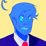
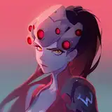
6. Form shading. I create a bright, saturate (so it will look especially red to emphasize the red lighting) red solid color layer (linear burn) and start painting in the basic form shading with a soft airbrush. I mostly start with shading at full and then use the airbush set to clear to paint away the shading, painting with light. The exception is for parts that I want to feel especially round and smooth, like the face, which I start without shading and just add shading in key places. For the hair, I used color burn for richer shading and start with a general, soft watercolor brush to get lay in some stronger hairs for a sense of texture, then use an airbrush to establish the overall form, then use a fingertip smudge to add some extra detail. For the more chiseled parts, I used a different shading technique. starting with a hard brush to make something like cel shading, then using watercolor brushes to add midtones, then using the blur tool to smooth the shading out where appropriate. I also added a pale yellow layer set to screen to airbrush in some soft highlights in key places. Note that I used desaturate blue shading outside the window for greater lighting contrast.
7. Cast shadows. I make a bright, saturate red blue layer set to multiply and start painting in the cast shadows with soft brush, using a smaller brush in places where the object casting the shadow is closer to the thing the shadow is on.
8. Backlight. For the secondary lights, I used a saturate red color layer away from the light source (vivid light so it will be neon strong) and a white layer toward the light source, both set to screen. Then I paint with a soft airbrush on opposite sides of shiny objects. The forelight is used only on the shiniest parts, mainly the decorations. When I combine it with the form shading, backlighting really makes the characters pop. I don't use any backlight on non-reflective objects. On the hair, I used the fingertip tool to streak in the shape of the hairs.
9. Shiny. For the glossiest parts, I used light watercolor brushes to paint reflections for both primary and reflected light sources, then I used a strong watercolor brush for the specular highlights (or a variable round hard brush when I want the highlight extra strong), using a thumb tool to smudge for detail. For the shine on the hair, I started with thin strokes with a soft watercolor brush, then use an airbrush to add a soft glow to groups of streaks, and finally use a soft round brush to erase a few streaks in the middle of each group. After painting all the shine, I use the cast shadow layer to make a selection and delete the shine from anywhere covered by shadow.
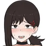
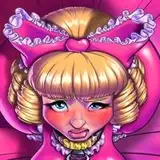
10. For the natural blush, I add in a raster layer and airbrush red just on the skin for the cheeks and places where bone is near the surface of the skin. I used the same approach for make-up. I added a noise texture (overlay) to the eyeshadow to make it glittery.
11. I added textures to a few areas (brickwork and grunge on the ground outside the window, a wood pattern to the floor inside the window, grunge on the stoop in front of the door), using distortion to match the perspective. I also hand painted some color variations to the brickwork and added red highlights where the edge of the bricks face the window.
12. Colored linework. Since the linework is still all vectors in Clip Studio, I simply selected the vectors and changed their color to whatever colored linework I needed, sampling from each section and then shifting the color to be more saturate and dark, more or less depending on how hard or soft I want each thing to feel. The hardest things I keep black. Then I collapsed all of the linework into raster layers, locked the pixel transparency, and used an eraser to fix up any places where different color linework crossed over each other or a multiply brush where the shadows were deep enough to require darker linework.
13. Eyelashes are done with a simple raster layer painted with a black variable-width pen. Then I lock the pixel transparency for that layer and use a soft pen to paint in grey streaks for texture and then soften the look with a few strokes of a black soft airbrush. I added some color to the tips of the lashes to make them extra fancy.
14. I added a layer of glass by placing very faint semi-tranparent white layer in front of the character and behind the exterior. I added some watercolor streaks of white shine, then scattered some red and white blurry spots to suggest reflected lights from across the canal.
15. For the neon sign, I started with a simple, uniform round brush to draw in the shapes of the letters in light red. To create the glow around the neon, I copied that layer, placed it behind, made it lighter, then very heavily blurred it and it to add/glow. To give the neon tubes shape, I made a selection of the red layer, contracted the selection, filled it in white on a new layer, then moderately blurred it to create a lighter core. Then I airbrushed a little desaturate blue onto the edge of the neon to give it a little more dimension. FInally, I added another layer behind it and painted in black tubes to connect the lit neon sections and airbrushed a little medium gray to give them a suggestion of shape.
16. Finally, I stamped a few sparkles in key places for fun.