hey everyone! happy monday! 😄
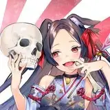
this week i have a some rough colors for a potential print i'd like to do!! i'm so excited for the entertainment district arc 🙈 i can't believe kny is gonna be coming back so soon...
🔽 i'll do a bit of a process breakdown since it's been awhile 🔽
the main part of the drawing-- the demons-- were from this sketch i did...last year...i believe?

i didn't have the original file on hand so i ended up just using a screenshot i took from my sketchbook LOL. i still really liked the sketch, and i've had the burning urge to draw something for s2 so everything worked out!!
i couldn't remember what i was planning to do with the original sketch, but based on the way gyutaro is leaning on something not drawn in, i just assumed they'd be on a rooftop of some sort. after that A+ detective work, i decided that along with them, i wanted to use the moon as another focus point.

here's the rough drawing i worked off of! the rooftops are based off what i could gather from the s2 trailers + the manga. it's rough around the edges and probably doesn't make much sense technically, but as long as you can tell it's a rooftop, it serves it's purpose!!
i'll try dissecting the layers juuuust a bit:
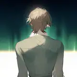
here's the background (minus all the layer corrections used to make it darker).

i think it's pretty clear in my work that i enjoy adding textures to my art LOL while some are used to add depth, i mostly like using them to add intrigue! i think a textured background, like this one, is more visually interesting than if it were a solid color.
usually having a base color, and adding a lighter, more saturated color on top with a texture brush yields the best results~

as for where you can get textured brushes, i personally recommend these: x / x / x / x
they're the ones i use the most!
as for the overall palette for the pic, i thought something simple would be best. to contrast the already crowded designs of the demons. cool tones at the top, with warmer ones at the bottom. even the moon, which is the brightest part of the image, is cooler!
from there everything else was pretty simple! i colored in the base colors for the demons and added some multiply/other color adjustment layers on top.
here they are without the color adjustments!

i think they look nice :-)
while these aren't perfect, i think they'll do fine as a loose guideline to follow when i move to the final!!
sorry for the rambling >___<)!!!!! i hope you enjoy your weekend!! hi-res + timelapse is below!
!!!!!!!!!!! flashing lights warning for the last 10 or so seconds on the timelapse !!!!!!!!!!! please be careful!!