DoujinStars
suitorarmor
suitorarmor

patreon


Ricon Concepts vs. Final

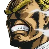
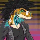
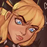
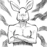
About time that I shared the early sketches of Ricon.

He started off as a redhead like Reimund before I decided that he should be Reimund's father's brother instead of his mother's brother - taking after the darker hair color and making the lineup less confusing. Once I found that direction, I was able to lean into it a lot more, taking into account that he heads the royal military and would probably favor a more practical outfit that he does not vary from in contrast to Reimund's revolving door of outfits. Although I made sure to keep yellow in his outfit as it is the royal family's color.

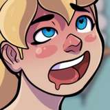
If any of you have every seen the 2003 Peter Pan live-action movie (one of my childhood favorites), I had images of Jason Isaacs' Captain Hook pulled up to try and capture those same intense vibes.

My assistant Ray helped a lot with the more detailed look of Ricon's metal arm and all and all I really loved where we ended up on him.

Because "Suitor Armor" has been a "from the frying pan into the fire" sort of project every step of the way, Ricon wasn't designed until approaching his reveal in Season 1. I hope he is as memorable a villain as I want him to be. Hate him tho. Evil bastard man.


Ricon Concepts vs. Final Ricon Concepts vs. Final Ricon Concepts vs. Final Ricon Concepts vs. Final

Comments

YESSSS, I love this WEBTOON so much 🥺

Ak4447

As much of an evil bastard as he is, what I love about his design is that he actually has the look of an upper middle aged man. He has lines in his face and greying hair. Such details I don't often see in cartoony media. Fantastic job, truly.

The result turned out very well and gives this character his very own appearance and look in this story!

ArkaTheWolf

Thank you for sharing this post! I love seeing how much detail and thought you guys put into designing this character and what your process was!

I LOVE that you referenced Jason Isaac's Capt. Hook and I can totally see it in Ricon now! Explains why I find him both utterly repellent but subtly hot.

Bethlee Swanson

Amazing work! I always love looking at your concept art! It's as good as "The Art of Disney" imo :)

Purpah, was there any hard parts to drawing Ricon?

Dreamland_Roses

I would’ve liked 4, make him look nice but have had a darker side to him,

Dreamland_Roses

Yes! I love that Peter pan over the Disney one. He looked familiar to me and now I know why. Hope you and your family are doing well, or as well as can be. <3

We hate him too! I would’ve liked 5 and 1 for him too.

Woahh you're so good at character design!! I've always loved the way draw his eyebrow wrinkles! Also hope things are going okay for you and your family <3

I love the concept art for him, number 5 on the first one is my fav but my personal fav will be the one we have now

Jali_Ranchers

Love seeing his progress! Hate this guy tho!

I kind of like bushy beard Rincon. Gives him a more evil priest vibe. His actual design is more sinister though.

Jnelle


More Creators