BETA 4.3- Graphic Viewer added
Added 2016-02-02 13:54:43 +0000 UTCHello everyone!
I was planning to present the extra section in fifth beta, but i need some feedback before implementing the rest of it. SO, I release this one for testing purposes. You can find it here:
https://www.dropbox.com/s/5sgoegkku55ic26/Beta4_3.swf?dl=0
So far, only the Graphic Viewer is working 100%. I disabled the others to not make confusion. And depending of the feedback, I will reproduce that pattern in the next sections. Let's focus in the Graphic viewer part for now.
Tell me if you like the layout, if it's simple enough to navigate, etc. We have others stances like the biceps flexing and muscle growth scenes. The problem its they are a bit more complicated to control, they have more stages and parts. And we'll have a event viewer too, so, in the end you will be able to see everything as you see fit once they are unlocked.
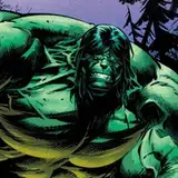
That's it. I am working on the layouts for Mack's Muscle burst sequence too. If you like Dragon Ball you will love it.
See ya!
Comments
Thanks! I will post another version soon. I added more buttons and others features.
ReddyHeart
2016-02-14 12:13:09 +0000 UTCGame looks great! Can't wait to see more..
1289dude
2016-02-14 10:09:47 +0000 UTCLima's graphics aren't complete yet. But yes, the graphics will be animated.
ReddyHeart
2016-02-07 12:05:14 +0000 UTCThe viewer seems to work fine, are the poses meant to be a still or are they supposed to move?
dbjwhite@hotmail.co.uk
2016-02-06 12:40:01 +0000 UTCThanks!
ReddyHeart
2016-02-04 12:01:20 +0000 UTCThanks for the notes. I did a new placement of the icons and buttons. Vertically oriented is working much better. I gonna post this new version soon.
ReddyHeart
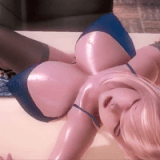
2016-02-04 12:01:15 +0000 UTCI've just tested the Graphic Viewer, and you did a very nice job. Being able to enjoy the girls' nice bodies that way is great :) Two remarks though : 1 - Pictures placed vertically would maybe help to understand of the organization. Columns : Portrait > Level 1 > Level 2 > Level 3 ; a row for each girl. As we, for the most part, read from left to right, and top to bottom, it might be easier to browse through the gallery. 2 - Everything is on the same side. Maybe the sliders on the right and the Level label still at the top but in the middle would be nice. Anyway, you continue to impress me. Thank you for your hard work.
CJoe
2016-02-03 21:10:12 +0000 UTCGreat idea. Something to identify the icon would be nice. I think "1" and "2" will work fine.
ReddyHeart
2016-02-03 11:54:22 +0000 UTCHmmmm... it sounds good. Bigger portraits and smaller icons. And yeah, aligning horizontally may give a better look.
ReddyHeart
2016-02-03 11:51:44 +0000 UTCThanks!
ReddyHeart
2016-02-03 11:47:10 +0000 UTCLoving it.
Cari
2016-02-03 09:31:58 +0000 UTCSo far So Good!
Paolo
2016-02-03 08:41:39 +0000 UTCIt looks and works great! It's nicely divided into three sections with the character icons, the stance and view selections, and the character model viewer itself, which gives it a nice and simple design layout that's easy to understand and clearly communicates what each part does. Having the unlock requirements on each red icon is a good idea too, just like most games with unlockables have. It's very easy to quickly cycle through all the different stances and views, and there's plenty of space for each of the character's images on the right side of the screen. As some people have mentioned, the icons do perhaps look a little pixelated, but that's about it. I'm not sure if a slight visual distinction between the act one and act two icons once they're unlocked might be necessary just to fill in that green space a bit, in a similar way to how the unlocked red icons have a cross on them (like having the top row have 1's marked on them and the second row have 2's, perhaps), but that's really all I can think of. Overall it's really good, and would definitely make an excellent layout for this and the other sections too!
The Alternate202
2016-02-03 01:18:58 +0000 UTCReally easy and simple to use, I like it.
Huggle
2016-02-03 00:40:48 +0000 UTCYeah works fine. The icons are kinda crude though and fairly large for the little functionality and visual feedback they offer, while the portraits are kinda small imo. So maybe have bigger portraits in 2 lines and a smaller horizontally aligned icon bar underneath each portrait?
Just Me
2016-02-02 21:32:44 +0000 UTClooks great
camel
2016-02-02 18:20:31 +0000 UTCGot it.
ReddyHeart
2016-02-02 17:42:43 +0000 UTCWell, I tried a darker tone and she got too... manly. This way is nicier.
ReddyHeart
2016-02-02 17:41:59 +0000 UTCI agree, it's too raw. I will do something animated.
ReddyHeart
2016-02-02 17:40:26 +0000 UTCGot it, thanks for the feedback.
ReddyHeart
2016-02-02 17:39:04 +0000 UTCLooks pre good. Although would love to have like a stance from behind, or at a different angle maybE
Vladdy Bladdy
2016-02-02 16:14:51 +0000 UTCWorks just fine.
2016-02-02 15:57:40 +0000 UTCoh no plz dont tell me Mack gets yeloow hair
Vladdy Bladdy
2016-02-02 15:49:46 +0000 UTCYeah, seems good. Icons themselves could use more work tho.
Alex Krycek
2016-02-02 15:39:28 +0000 UTCSeems to work just fine. Easy to navigate, and you tell us how to unlock the pictures. That's all I ask for.
tropetweeter
2016-02-02 14:44:34 +0000 UTC