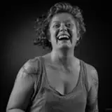
A couple grayscale figure lighting studies.
I wanna use this to stress the importance of using your lights for creating focal points and changing the reference to have a stronger focal point read.
The first, male figure, had a much stronger fill light, but for the sake of the composition and light design, I dimmed it down considerably so the focal point on his shoulder would be stronger.
I went for a similar strategy of having a strong primary focal point, but then also a couple brightly lit spots that guide the eye through the figure. This, coupled with an almost lost edge at the figure's back, makes for a stronger read.
The main point: You're not a slave to the reference and you need to change it, consciously making the decisions that are going to create the effect you're going for. (in this case I was going for strong, contrasting light)
Also pretty happy with the hatching brushwork going around the form