Hey everyone! I wanted to share a couple tips about painting rimlights!
Brightness
Here's a lit sphere.

Here's what that sphere would look like if you looked at it from below:

The same light would now look way more intense and bright - you can test this with any object in real life. This is because of the fresnel effect (which I might get more into in a different post), but regardless of the cause, keep in mind that rim light, unless from a really weak, diffuse source, will almost always appear very strong!
Silhouette
Rimlight is often used as a way to pop the character out from the background. Ideally, you wouldn't use it like this (because it can end up being a kind of a crutch), but if you haven't planned the values well, it's an effective way to make a clearer read.
Always consider what kind of read you want for different objects in your illustration (whether you want a dark on light, light on dark read, or a very weak read/lost edges. Here's an example of what you shouldn't do if you want a clear silhouette read:

The whole shadow area of the face and the hat don't stand off against the background, because the value is dark on dark, so a rim light would work as a kind of a compositional cheat in this case:

Dimension
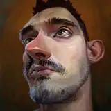
A rim light is also a good way of showing the form of the character at it's silhouette. What I mean by that is that near the edge of the silhouette of an organic form, there are often many foreshortened forms curving away from the camera and overlapping each other. Lighting these forms can give a much better description of them, since they often tend to be in shadow. Let's take this blob man for example:

There is some nice for overlapping going on in the shadow shapes (especially where the mouth is), but there's really very little light information there, so the overlapping forms are not described very well. Here's an example of how you never want to do a rimlight (unless you want to drastically flatten the form effect):

This is the the most common mistake people make when doing rimlights - treating it as an outline. What you instead want to do for a good form read looks a bit more like this:

By overlapping different thin and thick rimlight shapes here, I'm actually describing the character of the forms and how they actually overlap each other.
Hope that was useful, please feel free to share any comments or questions!
God bless,
Ognjen