
This article documents the drawing process of a piece titled "The Day of the Past", which is a practice from last February.
The source of inspiration and reference picture for this drawing is very simple: a photo of my mother and i (me as a child) taken by my father.

When the first outbreak of the pandemic happened early last year, I returned home from Australia for a 14-day quarantine. The confinement lead me to pick up and flip through old photos of my family, which was rare. In this photo, my mother is kissing my cheek and I am hugging her with great happiness.
The warmth and happiness in the photo appealed to me, and the very idea of turning memorable moments from photos into illustrations was also a very meaningful one. With this in mind, I started to work on the piece.
Based on the photos, I made a rough sketch.

Afterwards, the sketch was outlined accordingly for a more defined finish.

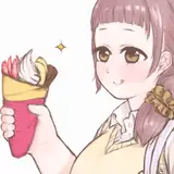
The distinctive color of the figures basically followed the original color scheme in the photo, with the only change being made was the replacement of my mother's red coat with a green one. This is because I wanted the most vivid red tones to appear on the cheeks of the characters and not be stolen by the coat for visual contrast.

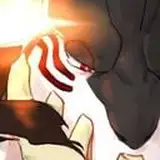
The photo itself was taken at night, and the only original light source was the flash from the digital camera. However, I wanted the illustration to be intensely illuminated by warm natural light. Therefore, I built the corresponding pose in MagicPoser with reference to the original photo and added the new light source, which emitted from the left.


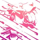
New multiply layer to draw shadows, the effect is as follows.

In the light areas, I added a light purple darkening the layer to adjust the light areas to a slightly more cool toned purple. Then, using the splatter tool again, I added some gradients to the ends of the figure's hair, and the top of the jacket.


With the general relationship of the image almost finalized, I merged the figure layers and started refining them.

Using the Brush tool(画笔) and the Splash tool(喷溅), I deepened the color of the character's hair in the dark areas. I used a darker shade of orange to color and add lighter and darker transitions at the border between light and dark skin, and added highlights to the cheeks and bridge of the nose. In addition, I deliberately weakened the definition and brightness of the lines to give the image a more semi-thick texture.


In fact, this painting was created in a very sloppy manner—I didn't even think about adding any background when I painted the figure.
So now comes the problem: I gradually found that the white background looked a bit too monotonous and the finishing of the picture was a bit off. However, as the characters themselves are already extremely rich in form, it is not advisable to add too fancy a background on top of that.
After some thought, I decided that a simple sky gradient would be the most appropriate. Finally, I chose Dmitri Anatolyevich Belyukin's twilight landscape as a background reference.

According to the reference, I tweaked the background to a yellow-green gradient.

Then, I adjusted the brighter areas of the people to warm yellow, so that the overall picture is more harmonious.

The little girl's yellow coat and the background color look slightly close, so I want to try to change the coat to a light pink. The operation is very simple yet brutal... add a new layer directly on top of the the original, then add the color to be modified to.


After merging the figure layers again, I added some yellow dotted petals and brought some yellow gradient at the bottom of the background to compliment the color of the petals.

The saturation and contrast of the figures were also slightly enhanced. I added the same yellow color as the petals at the junction between the face and the clothes to make the color relationship richer and more harmonious.


The image has been extremely well developed in the previous stage, so I only added a special layer of light and lightening to brighten the image, and defocused the lower half of the figure to increase the realism.


Now, the illustration is finished.
It's a fun experience to draw an illustration from an old photo of your own home! The original material and experience is completely yours, and the emotion it holds is unique. You can also try it when you have time XD
This month's illustration experience shares a total of two pieces, there is also a "The Tale of the Bamboo Cutter" drawing process, do not miss if you have not seen it!

So that is the Behind the scenes + process for July, I hope the content I've provided is helpful.
Still thanks to my friend Valerie for providing me with help for English translations, and you're welcome to comment if you have anything to talk about!
See you next time ~