


This post documents the process of two doodles from 2019 & 2020 respectively.
The first one is completed at around the end of 2019, while the second one is part of the 'Childhood' series from the beginning of 2020.
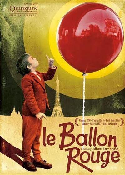
The first inspiration came from a French movie titled "The Red Balloon".
The ending scene of the movie depicts the little boy surrounded by countless balloons and flies up into the sky, holding their attached strings. I was impressed by the infectious atmosphere of that snippet, which made me want to draw an illustration of a child with balloons.
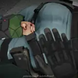
The elevated perspective was determined from the beginning, but it required a high level of observation and referencing of the human anatomy and perspective. So, I set up the reference model in MagicPoser and sketched up a draft based off it.
Refining the sketch from the draft:
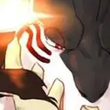
Then, add figure shadows according to the model's light and shadow reference.
Subsequently, close up balloons were added with the inherent color of the characters.
To distinguish the depth in the front and back view, the balloons that were more distant were illustrated with an increase in brightness and less saturated, while the balloons closer were darker and more vibrant in color. The entire layer panel is shown below.
After finalising the relationship of the whole picture, I merged all layers for further refinement.

As with the balloon, there is also a spatial front-back view of the figure's arm and face, with the arm in front and the face in the back. I lightened the color of the face as a way to bring out the distance between the arm and the face.
Special brush 轻触 is also used often in this painting. It has a larger grain as compared to the splatter brush (喷溅) and l mainly used it under the balloon and the figure's hood.
These default brushes came with the software and I have not made any adjustments, so Procreate users can find them directly inside the software. The brushes I have adjusted have been shared in my previous post, VIP2 i.e. above patrons can download them directly.
The rest of the refinement thought process is similar to the one in my previous article. I continued adjusting the shapes whilst adding shadow and details, and used the splatter brush to enrich the texture of the image.
(The sudden yellowing of the screen is from the overlay of a yellow positive layer in the middle, and the blur at the bottom of the screen is with the effect of added Gaussian blur. I completely forgot to save the process, sorry!)
The background now looks a bit monotonous, so I considered changing the background to a blue sky. Since the layers have been merged, I can only select the existing area through automatic selection, then create a new layer filled with blue.

Automatic selection will cause obvious edges (you can clearly see in the outline of the character's fingers and the balloon on the left), and these edges will inevitably make the balloon's edges too visible and rough, so I manually blurred the balloon's edges to maintain the picture of the relationship between reality and fiction.
(This is not a smart approach. Don't merge the figure and background layers too early on when you're painting, or you'll end up with this!)
The existing colors of red, yellow and blue were already sufficient, but I wanted to try to make the colors more colorful. I added a close up of green balloons and added colorful dotted decorations.
In the previous painting process, I used the splash brush frequently to add stippling particles to the image, and the extensive use of gradient colors made the entire image very rich in lightness and color variation. Using the auto-selection tool, I was able to naturally select areas with odd shapes.

Filling the areas selected by these boxes with the new color will result in blocks of color with special textured borders.

Subsequently, I used a special brush dry brush(干画笔) to enrich the texture of the balloon.
Once the detailed elements were added throughout the image, I again fine-tuned the overall colors and added light blue highlight in areas like the balloon strings, distant balloons, and the character's hair and headband.

Because the colors and characters of the second picture were continued from the previous one, I'll show the process of two images together this month; and the PSD file will also be directly available for both pieces.

This is a continuation of the ‘Childhood’ series, the picture still retains in the form of character plus scene, and pays more attention to the composition and design of the picture. I directly referred to photos of itinerant vendors as elemental references; these photos were taken in the square of my hometown.
Based on the photos, I naturally got decorative with elements like balloons, rubber balls, bubble machines and inflatables, which I combined with the figures to get the draft shown below.
Then, with reference to the magicposer model, I added light and shadow to the character's body.
Although I also posed the model with a version of the balloon, I couldn't draw the balloons as purely round shapes, but more extruded and heart-shaped, so the final light and shadow was not referred directly to the model—more like the ones in previous photos.
Afterwards, add the essential base colors for the character, plus the shadow colors below the draft layer.
The color scheme of the picture is almost the same as that in the previous illustration; the background shade was also taken from the previous combination of blue sky and light-colored balloons.(Saves me a lot of time!!!)
The general layout of the picture was settled, and then I began to refine it.
To bring out the transparency of the balloons, I used the splatter brush to spray the edges of each balloon with the secondary shades from the surrounding balloons. (For example, the bottom of the blue balloon will take on all the warm yellow of the yellow and red balloons, while the right side of the red balloon will also take on the green of the green balloon.)
The previous draft messy lines were also erased at this stage, after the balloons were gradually shaped and then clearly outlined.

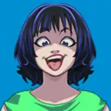
The figures were adjusted accordingly. I corrected the lighting pattern of the girl's face, deepened the shadows of the hair in the darker parts, and erased the draft lines at this stage to create a clear outline.

After the refinement of the main part comes the refinement of the related secondary items. I shaped the ball and the toys under the girl's feet, and added the balloon strings that was not drawn before.

Regarding the background border, my initial idea was to draw a classy border with a rich and beautiful outline (as you can see in the sketch), but at this stage, I thought that an overly complicated border would shift the viewer's eyes away from the balloon, so a square background with a simpler outline would be a better choice.
I had to think about what texture to use for the square border, and considering the nostalgic atmosphere of the image itself, I finally thought of using an old newspaper material.
Using Procreate's Liquify, I selected Crystals and applied it directly to the layer to give the object a natural burlap effect.
(The motion picture was recorded by the way I did the declaration XD, you can see the white border line was painted and then the natural appearance of the blur)

Finally, add the same ribbon to the top of the layer (as shown in the previous illustration), and the whole picture is finished.
-
That is all! Still sending thanks to my friend Valerie for providing me with help for the English translations, and you're welcome to comment if you have anything to talk about!
See you next time!
Sheya
2021-08-04 16:48:59 +0000 UTCjhon derling cardona villa
2021-08-02 22:38:56 +0000 UTCMilk Tea
2021-08-01 16:42:35 +0000 UTC