Behind the scenes + process: Early Spring & Summer
Added 2021-12-01 16:27:12 +0000 UTC
This post documents the process of Early Spring & Summer.
Tip
Before reading this post, please read the process of Different Seasons. I used the same techniques and you will gain a better understanding when they’re viewed in conjunction.
https://www.patreon.com/posts/behind-scenes-51590958

Starting from Inspiration
At the beginning of January, a friend recommended an app called Glaze.

Glaze is a free app with filters available for both iPad and smartphones. After importing your picture, simply click on the different boxes below and your picture will be automatically transformed into a variety of hand-drawn textures.


Though the resulting image is much less detailed than the original, I found the brushwork and textures quite visually pleasing; it reminded me of the impressionism works I enjoyed seeing.

(Painting by Volkov, Daniil)
Although my works have absorbed a lot of color from Impressionism, the way my works are shaped is extremely different from the art movement itself. So with Glaze, I wondered—is it possible to create a piece that comes close to the Impressionist paintings in terms of color and shape? I chose the following photo to try it out.

This is a random photo I took when I was back in my hometown. There wasn’t much sun shining that day; the surrounding scene was not clean either. However, I really liked the overall vibe emitted from this space brought by the steep staircase, and modifying it on the basis of this photo may produce a picture with interesting composition.
I made the following sketch with reference to the photo above. The center of the stairs in the original photo is very empty, leaving me with just enough space to add a character walking down.

Determining the colors
I proceeded to hunt for corresponding impressionism works for reference. In my mind, I thought the illustration would embody greenery accompanying a cemented ground, complete with a sky, so I focused on works that contained these three visuals.

It is a pity that the coloring process of Early Spring was not recorded, so the coloring process of Summer is used here as an example.

The original photo for Summer was taken during a trip to the beach with my brother. The colors and scenery in the picture itself were already excellent, so the final illustration was not altered too much. I wanted the image to look as cool toned as possible, so I searched for three impressionism illustrations in shades of blue and purple.

Use the previous method from Different Seasons to highlight different areas of the photo and fill them with color by using the auto-selection tool.
(Do read it if you haven't!!! That post dives into great detail!)


Add a gradient color block below this layer to serve as the background base color of the screen.


Continuing with the selection, I filled in the colours for my brother's clothes, skin, and other elements.

A brighter shade of green is then added.

Finally, some red color blocks for my brother's hat and toy car.


Early Spring 's coloring process is also similar to the process above, but because the original photo itself is weak in light and shadow, the shadows can only be artificially selected. Hence, I let the elevated part of the mid-view from the stairs to be cast as a shadowed area, and the rest of the place is subject to light.

The wall from the original picture was dirty, so I made the white wall more distinguished from the moss and added some bright orange to give it a touch of colour.


The foreground and midground are really starting to come together, but the houses in the distance are too busy; with railings above and the tree stumps being rather dull too. I applied some random blocks of color to the top of the layer to hide these cumbersome elements.


After painting, the distant view appears more empty and the layout more unified. However, further refinement is still a problem down the road.
Using Glaze to add oil painting texture
Normally, at this stage, I would have repaired the edges with a single stroke myself and continued to refine the image step by step.
However, given Glaze's ability to blur details and add multiple brushstrokes, putting a highly detailed image into Glaze would make the shape of the image very vague. Instead, you can put works in progress into Glaze to get quick results, so you don't have to worry about the finely honed images becoming rough. (Because it is already very rough lol)
I selected the third category from the bottom left and waited for the results; not knowing if it’ll turn out well.


The effect... is quite good!
Apart from the regular square objects (steps, walls, etc.) that became sticky under the automatic processing, the rest of the content was so good that I was a little surprised...the brushwork of the picture looked spontaneous and soft, and you can see the texture of the canvas paper when you zoom in to see it.

The flaws are shown in the picture below, where some angled items that should be clearer have been edited so that the outlines are not visible (picture left). I had to erase these overly vague images with an eraser to bring back the contours of the angled items. ((picture right)

The comparison before and after treatment is shown below. The main cleanups are concentrated on the outer contour area of the steps.


Model Aids
The early drafts made it clear that the characters would be added, but the shape and perspective of the characters needed to be further refined.
With the aid of MagicPoser, a reference model is established for the corresponding scenes and characters with a more detailed pose.


Between the character holding the wall and standing free, I chose the latter—the figure can then be bigger and centralised in the frame. The composition wouldn't be too far off too.

At that time, the character's clothing and coloring were not yet determined. I tentatively thought of an exploring type of character and added a hat and backpack for it. Considering the character being an adventurer, I think the vision can be fitted more appropriately to the fantasy theme with some flying fish.

Refine characters
Refinement of the character based on modeling assistance. This process often involves experimenting with various changes to the character based on actual screen effects, sometimes even overturning the earliest ideas.


In one adjustment after another, the character's costume gradually changed. At first it was just a natural choice of adventurer brown, but then I realized that the main character's color was too monotonous, so I added some cold purple. After repeated iterations, the character has changed from my initial vision of the adventurer to a little girl heading home after school...
Fortunately, the essence of this picture originated as a doodle attempt, so the content settings can be still be changed on free will.


Adjusting the distant scene
I found that I can’t draw a fish successfully. Maybe because I knew very little about the structure of the fish, or maybe I could not adapt to the oil painting texture of the image at that time… After many unsuccessful attempts, I chose to temporarily hide the traces of the fish and replaced the distant scene with a sea of clouds.

Without the big fish, the column in the center of the distant view looked a bit monotonous and abrupt, so I removed this pillar to make the whole distant view unified.

Import the image into Glaze again to add an oil painting texture to the character and sky.


Finally, there are some unobtrusive fine adjustments. For example, the platform in the distance is brightened, the railing at the top of the picture is defocused, etc.
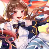
Obviously this picture is not a finalised product, since it is really a new attempt for me. This was done a few months ago, and looking back now I feel that there’s still plenty of room for further development. If I have spare time in the future, I’ll probably adjust it again.

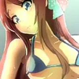
The second image
Back to the second image-Summer. In the previous step, I rendered each item as a color block through a selection.
In further refinements, I changed the base color of the sky and beach to blue. For the composition, the green fence was moved right to make the silhouette of the figure more clear.

The grass at the bottom right of the picture is based on reality, but having placed it in the illustration—it turned out different from the actual eye’s perception, so I ended up removing it.

Use MIX to adjust tone
Though the coloring is finished, this picture still lacked an atmosphere to look complete. I had a vague feeling that the color had something to do with it, but I couldn't place a finger on how to adjust it.
Usually, I adjust curves, color balance, or add some special layers in Procreate to modify the colors. But occasionally, I also play with some other tricks… such as dragging the image into a filter app.
I use MIX, which is also available for free download on IPad and smartphones. The functions and interface are the same as most filter apps; just tap on the rich filter library visible below, and select one of the squares to preview the filter’s effect.


The one thing that makes the Filter App more fun than manual adjustments is this— it always presents colours that I would never try.


These overexposed characters and the ground, with aibao-like color… these are the sort of colors that I would never try. When you have drawn for a long time and do not know how to improve your drawing, throw it into the filter library, you will suddenly see a picture full of freshness.

Finally, I got some inspiration from the C105 filter - to warm up the color palette slightly; with a sky that is more blue and a beach that is more golden.

I adjusted the colors slightly based on this image and cleaned up the overly rough blue shadows underneath.

Import the image into Glaze again to see the oil painting effect.

I was very pleasantly surprised by the results this time as well! I personally liked the small blue shadows on the beach and the random brush strokes on the right edge, so they were retained in the final image. The central areas of the figures were kept in the same shape as before, allowing space for clear details.


-
This time it is mainly an APP amenity conference, since I received some private messages asking me how I did the oil-like texture...

Over these years, a variety of filter apps have emerged, and as an Ipad drawing user, it's really convenient to download a few in the App Store and put pictures in to see what can happen.
However, Filter APPs are only an aid, the most important thing is your own drawing ability—you still have to spend time practicing!
That’s all! Still sending thanks to my friend Valerie for helping me with the English translations. You're welcome to comment if you have anything to talk about!
See you next time!
Comments
Thank you!!
Sheya
2021-12-04 09:42:00 +0000 UTCThank you! :D
Sheya
2021-12-04 09:41:51 +0000 UTCIt's very fascinating and fun where the teacher gets inspiration from. Thank you for the good writing.
iloveyou
2021-12-03 16:32:42 +0000 UTCahhh thank you so much for the explanation sheya sensei ><
Milk Tea
2021-12-02 10:07:12 +0000 UTCThank you!
Sheya
2021-12-02 02:06:15 +0000 UTCThank you for such detailed explanations! It's so interesting to see how each piece is made and what kind of thought process and artistic skill is required.
Fury
2021-12-01 17:17:47 +0000 UTC