Behind the scenes + process: Alice
Added 2022-01-01 10:13:41 +0000 UTC
This post documents the process of a piece titled 'Alice'—which I drew back in June this year.
The initial inspiration
While browsing through Pinterest one day, I happened to come across a few Alice themed photographs.


I have always loved Alice themed works, and these two photographs struck me with new inspiration that motivated me to draw. Referring to the overhead view of Alice at the tea party in the first work, I made a random sketch.

The overhead perspective presents an inverted triangle composition with a table filled with a bustling afternoon tea set. Alice is looking to the right of the picture with her cup in one hand, with a suspended magical teapot tilted slightly downward to pour her tea as everything sits on top of a simplified white space.
The sketch looks quite clear and feasible. However, my spatial perspective has never been strong, and even with the reference of the top view of the photo, it was difficult for me to gauge the specific structure and shape of the figure. So I quickly chose 3D model softwares to assist me.
Model Assist
This time, I used the same software that I used when I drew "Koto"—Daz3D and Blender.

First, use DAZ's sakura model to build the corresponding pose of the draft.

The model was then imported into Blender, where simple lighting was added along with the tables, chairs, benches, tea sets and other elements.

I did not model the tea sets and cups manually. My major at that time had a course called packaging design, in which one of the assignments was to provide a full render of a container model. I was lazy and downloaded some free container model files from a model website, and those downloaded models were used this time...

(The site I was using was called turbosquid. After registering for an account, I entered the keywords in the search interface and selected "Free" in the "Price" at the top left filters to download the free models. https://www. turbosquid.com/)

I searched for keywords like tableware, teacups, teapots, cakes, vases, wine glasses and other categories, downloaded the models I thought were more useful, then imported them into my blender file and arranged them on the desktop for layout.

After the composition and the main object shapes were established, my modeling process was over.
As I said before in the "Koto" process record: I personally prefer painting and rendering the piece myself step by step rather than finishing everything in the modeling software. This 3D model acts more as a lighting reference, so the shaping at a later time is deemed better.
Importing to Procreate
After importing the rendered image into the painting software, I sketched out the human body based on the model reference.

Then, I filled in the base colors under the line art’s layer. Since the model has a clear outline shape, I skipped drawing the line art for the scene and used the automatic selection tool to get a clear outline shape of most of the items directly.


Adjusting the tones
The previous colors were a bit too bright, so I slightly reduced the saturation and vibrancy and moved the tones closer to the warmer side.

Add shadows
Select the shadows of the model with the automatic selection tool, fill in the color, adjust the layer mode to positive overlay mode, and place it on the original base color layer.


Adding ground texture and fine-tuning colors

Although the shadow’s color influenced by the positive overlay is completely accurate, I personally preferred the near artificial-exaggerated color effect. Hence, I started to adjust the color of some of the shadows above the positive overlay layer and added some texture to the grass.


Merge layers to refine and adjust items
The next step is to merge the layers for further refinement and adjustment. I made another change to the color: the brighter parts are more orange, while the darker shadows are now more purple toned. In addition, Alice's face, hands, and clothing were slightly refined.


However, at this step, I encountered a new problem—both the objects on the table and the shadows on the ground were too mechanical and simple in shape.
This is a common problem in modeling: the basic model outline is extremely standard and geometric, but the illustration emphasizes the richness and vividness of the shape. When the modeled items are transformed into illustrations, the outlines of the items are too simple; which makes the illustrations less attractive.

The tabletop, which seemed to be quite covered at the model stage, looked so empty after it was transformed into an illustration... The solution I came up with at that time was to add some more natural forms and extremely rich outer-contour-type items to that base.
Adding plants and projections
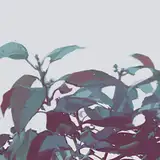
I selected some flowers and plants that I photographed on campus, selected some parts of them with the auto-selection tool, shrunk them and placed them in the right area of the picture.


The original green color of the photo did not fit the illustration, so I used the color balance tool to bring the tone of the photo slightly closer to light purple.

Afterwards, duplicate the original flower layer, use the paint bucket to fill it with a shaded purple color, and adjust the layer’s mode to "darken".

Move this layer down to form shadows.


The same technique was used for the shadows of the daisies in the grass. However, a panning shadow with just the petals would look too flat and fake, so I added some more diverse plant shadows.

The previous selection of cakes also had too geometric in form, so I replaced them with rounded teacups and added some petals and leaves.


Adjust the color of the shadows and bring a slight green gradient to the edges of the shade to make the shadows look more transparent.

Apply more green to the leaves to enhance the colors of the shade.


Color Adjustment
In fact, up to the last step of the painting, I didn't even bother to look for a color reference. But since the current colors did not satisfy me, I went back to search for some reference images.

The previous image had orange and purple as its main colors, but after searching through some reference images, I considered changing the main colors to a brighter light green and blue. Below are some out of my many attempts.

In the overall adjustment, the overall yellow ochre color of the picture had turned green and the shadow’s color was unified towards blue. In addition, I brightened the blue shade under the table and enhanced the base color of Alice's blue clothing, which made the shadow areas more breathable and the characters more prominent.


This was followed by some more subtle adjustments. I added highlights to Alice's pupils and gave more definition to the shape of the sleeves and skirt.


Finally, add on an apron with a poker pattern for some subtle fine-tuning.


That's all! Thank you for reading.
-
Happy new year guys! I hope you all are doing well, and I hope the content I've provided is helpful. :)
Still thanks to my friend Valerie for providing me with help for English translations, and you're welcome to comment if you have anything to talk about!
See you next time!
Comments
Hi Mina! I chose the 350 resolution because I need to print picture books and other paper products! But actually 72dpi is enough to see on the screen. As for the procreate canvas limitation you mentioned - that did bother me a lot at first too! But as I became more familiar with painting on a layer, I gradually felt that it was not a big problem anymore :D
Sheya
2022-01-15 08:23:52 +0000 UTCHello! I've been taking a peak at canvas sizes and resolution lately and I am also a user of Procreate. I've been wandering, is there any particular reason why you chose a resolution of 350? I notice how in procreate we are limited to a certain amount of layers and I wonder how do you work around with such a large canvas and high resolution at the same time. Do you ever get used to it?
Mina
2022-01-10 15:46:45 +0000 UTCThank you!
Sheya
2022-01-04 15:50:26 +0000 UTCThank you!
Sheya
2022-01-04 15:50:20 +0000 UTCLooking at the teacher's painting widens my view. Thank you so much for the good explanation.
iloveyou
2022-01-02 05:49:01 +0000 UTCThis one is one of my favorite pieces of yours, Im so happy I got to finally learn the process 😌
April
2022-01-01 18:07:45 +0000 UTCThank you Milk! Happy new year!
Sheya
2022-01-01 16:29:37 +0000 UTCaaaaaaaaaa thank you so much for sharing sheya sensei! i always loved to see your illustrations ;;;;
Milk Tea
2022-01-01 12:10:11 +0000 UTC