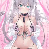
Behind the scenes + process: Marisa
Added 2022-05-01 07:41:22 +0000 UTC
This post documents the process of an experimental piece done earlier this year.
Inspiration
The initial inspiration came from an old photo taken by a family member of mine.

Although the photo taken wasn’t very clear, the dynamics of the people and the shadows casted by the trees made me feel comfortable. It made me want to adapt it into an illustrated piece.


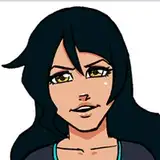
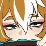
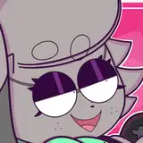
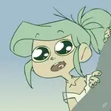
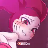
The main reason behind Marisa is related to a previous idea; I wanted to draw a series of fanart about the Touhou Project at the beginning of last year. So when I encountered any creative inspiration, I would give priority to the characters from Touhou Project. At that time, looking at this photo, my first reaction was to depict Marisa holding mushrooms.

(As for why it has to be red and white poisonous mushrooms - that is my childhood watching "The Memories Of Phantasm" and playing "Marisa and the 6 Mushrooms"
The character should be quite happy upon harvesting so much mushrooms, so I gave her a smile.


Fill in the base colours below the draft, then tweak the shadow’s layer mode to Multiply.


Adding the Background

I wanted the piece to be saturated and vibrant, so I searched for brightly lit scenes for references.
Thereafter, I placed the old family photo behind the figure, selected the dark and light parts of the tree using the auto-selection tool and added in the base colours whilst referencing the colour reference image.


Character refinement
After cleaning up the lines from the previous draft, I redid the outline of the figure to bring clarity to the shape of the face and hands.


The colours were also readjusted. To complement the green trees in the background, I adjusted the shadows to a more greenish colour.


At the same time, I added a deep red layer (set its mode to Add) above the base colour layer to make the lighted areas look brighter.


The effect of the shadow layer and the lighted layer is shown.


Merging layers for refinement
After the light and shadow colours of the characters were set, I tend to merge all the effects layers for refinement. In no time, I was able to reduce the number of character layers to 2: one line art layer and one coloured layer.

The lineart serves as a refined draft with many details based on the original.

The coloured layer adds a richer body while maintaining the integrity of the original colours, such as the light and shadow of the hat, the shape of the mushroom, etc.


One layer character refinement
This time the refinement didn't go well. In the later stages of checking, I realised that the figure had become increasingly rigid, and that too much emphasis on the line art was preventing me from making bold changes to the shapes.
So, I simply merged the layers, ignored the lines and treated the figure as a block of colour that could be changed at will.
BTW, some of my friends prefer to go with a clear line art in order to determine accurate shapes, while others are more accustomed to rendering on a few large blocks of colour. And in my case, both painting methods are acceptable.

Sometimes when I can't continue to shape the colour block, I add in the lines, and when I can't continue to shape the line, I turn back to the colour blocking method. Through another's eyes, it looks like I'm repeating the process of “outline, colour block, outline”, which makes people wonder, "Why did you redo the lines again and again?"
But the truth is that—only through this way— I can make the brushwork easier and easier and the shapes more and more lasting.
---------------------------------------------------------------------------------------------------------------------------------

In last month's behind-the-scenes for "Alkaid", I also took the drawing approach of fixing the shape directly on the colour block and then added lines to the block at the end. This time, it’s almost identical to “Alkaid”.
The process PSD file is also much more complete, so I can show you this step by splitting the layers of each stage.

First, in stage 4-4, the additional strokes overwrite the original line drawings, the hats and hair are colour blocked, and the outer contours of most items are free of lines.

On layer 4-5, I started adding the contour lines of the hair and brim.


After layer 4-6, the facial shape of the figure is gradually brought out. The contour lines of both the hair and the hat also become more and more complete.


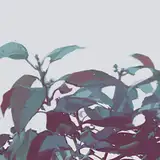
Background optimization
As the background of this change from the photo, there had previously been a large blank in the centre of the screen— which of course is not a problem. After all, the character (Marisa) will cover the area.

What really needs to be improved is on both sides of the picture; the part of the picture that is finally displayed. The original photo had people on both the left and right of the frame, and the automatic selection brought out their forms to a greater or lesser extent. I used the brush tool to erase these irregular shapes and give the image a regular grassy look.


Arm adjustment
In the previous photo reference, the character was holding the rabbit in her arms, which gave the arm a one-over-one perspective. However, the rabbit was replaced with mushrooms in this illustration, which makes the character's arm look slightly weird.

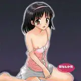
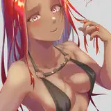
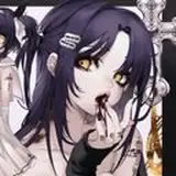
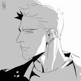
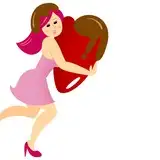
Referring to the action of Alice holding mushrooms in her arms (picture below), it was obvious that both arms had to be at the same height to seem more natural. I also considered pulling Marisa's left arm inward and adjusting it to a posture closer to the height of her right hand.


At this stage, the character layers were all completely merged and it was quite tough to adjust the arms again. I almost completely redrew the upper half of the character's body, and then overlaid the redrawn arm’s layer below the original image.


Then, add new mushrooms below the arm’s layer to make the final image come together.


Using the brush 画笔 to paint on the light and dark juncture of the arm to make the light and dark transition of the arm less harsh and more natural.


Final refinement and adjustment
In the later stages of refinement, I brightened the overall vibrance and saturation of the characters and brought focus to the mushrooms in their hands.


I added more red gradients to the mushroom where the light hit, and darker bits to make its shape look less opaque and fuller.

I added a layer in front of the figure to focus on the loose lines of the hat and blouse, giving the whole image a more relaxed look. The back layer of the figure has more flowing hair to give the image a more dynamic feel.


There are some very subtle adjustments at the end, such as a little Gaussian blurring of the background surrounding the character.


At this point, the illustration is now complete step by step.
-
This time, the process is quite simple, basically no magic operation — only steady progress and repeated revisions. (This is also the state of my recent project, I'm used to this simple process...)
Coincidentally, with the increasing number of supporters, I have received questions along the lines of "can you share your video painting progress?" from time to time. Good news, I have slowly started to record the painting process in the past few months.
I now have a good stock of recorded videos ready and will open a new tier with recorded screens this month. I hope that my sharing will be helpful to you!
That’s all! Still sending thanks to my friend Valerie for helping me with the English translations. You're welcome to comment if you have anything to talk about!
See you next time!
Comments
aa thank you so much for sharing >< i really love this piece ToT
Milk Tea
2022-05-01 08:19:43 +0000 UTC