Behind the scenes + process: Yesterday Once More - Kites
Added 2022-06-01 14:22:15 +0000 UTC
The main process is documented drawing and writing simultaneously ~
Origin of the drawing
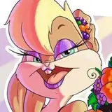
This piece is part of my graduation project titled "Yesterday Once More", which is a series of illustrations depicting memories from my childhood.
The illustration was first sketched last December; mainly to show the variety of kites with the children's joy. In the foreground, there are many people—and in the distance, there are various kinds of kites.

Line drawing and coloring
There are too many reiterations done for this piece, so I'd like to skip the early drawing explanation as much as possible. (A lot of previously drawn content was overturned and redrawn at a later stage.) Let's just take a quick look at the process pictures.


The kites are basically referenced from my own photos. The long flowing kite was taken from a park back in my hometown, and the swallow kite held by the girl is the same as the one in my house.


The photo-to-illustration process is almost the same as my previous works—it is still an automatic selection on the photo layer followed by a new layer to fill in the color. For a detailed textual explanation, you can click "DIfferent Seasons" process tutorials.


Adjusting the character’s style
Since it's the first picture in the series, the drawing of the kite was full of hesitations and compromises; you could see in the picture above that I initially drew a more realistic character in order to meet the requirements of my art school. (The instructor did not accept too cartoon-styled characters)

However, it was too demoralizing not to be able to paint the character in a style you like! So after struggling with it, I switched back to the style I'm used to and repainted the characters based on the model built from Daz to Blender.
(For a detailed text explanation of model-assisted painting, please refer to the process tutorial of Koto.)


Color Reference
My general idea for the colors would have less saturated characters with darker and grayer shadows, whilst the kites in the background could light the layout up by having a saturated and colorful look. However, I wasn't able to find any suitable references for the color—not many works have the style I was looking for. It was quite frustrating.
By chance, I found a scene on Pinterest that was pretty close to my composition—it was a dark foreground figure and a distant sky with floating decorations in light, and it was extremely rich in quantity and color. This immediately gave me inspiration.

After clicking on the link, I learned that the artist is 鵜だ. You can follow and support this artist on Twitter and pixiv > <

Inspired by 鵜だ's illustration, I darkened the sky and figures to bring up the brightness and purity of the kite.

I copied and pasted the previous long cloth kites and zoomed in and out to get a huge number of kites of different sizes. (Although they are all the same kite if you look closely XD)

Adjust the kite to red, orange, green, yellow and other colors according to the reference picture; the image immediately becomes richer and more colorful.


Variety of kites
The current kites are colorful, but they are only based on the limited number of photos I took in the park, which are inevitably monotonous in shape. After viewing many videos of the Chinese Kite Festival, I have further enriched the kites.


In the midst of my research, I especially liked the lively shape and vivid colors of the dragon kite. I placed it in the most visually eye-catching area.


Overall Tone Adjustment
The previous tones in this image were basically referenced from 鵜だ's illustration, but I personally didn't want the final color effect to be too close to the reference image, so I started subjective color mixing again.
I merged the existing kite layers as a whole and brightened them up. The girl's clothes and hair were also slightly adjusted.


Halfway through the process I also exported the image and put it in the iPad filters to see the different color effects. I was inspired by the "DRAMATIC WARM" filter mode to give the sky a more greenish tint.


Character redrawing
The drawing has reached a late stage of refinement, but I have been unhappy with the current look of the characters. I always felt that the character's pose was a little stiff, and the elevated view originally planned did not come through.

I told my friend about the existing problem, and she suggested that I could use a long line from the upper part of the figure to the waist to strengthen the dynamic momentum, and the curved line at the waist could also be strengthened to suggest looking up.

Big thanks to my friend!
In the final finished picture, due to the lack of ability, the performance of my elevated view is still very lacking… but by emphasizing the character and the long line of the pleats, the character's momentum and vividness is really enhanced!


Dragon's head repainted
The current version of the dragon's head is well-drawn, but the shape seemed too heavy; floating in the air and somewhat heavy and not breathable. The elevated perspective that should be present is also not reflected because of the perspective of the dragon head.

So, I re-collected the references from the elevated view and redrew the kite. It was so hard to find a good elevated view of the dragon kite and the most suitable reference image was a screenshot I took myself from a low resolution video.


The figure was also refined. Based on the color of the previous sketches as a reference, I turned up the opacity of the line art layer and used the brush tool to lightly paint the face, folds and outer contours of the figure to make the lines softer.


Final refinement and perfection
The final adjustments were mainly focused on enhancing the vignette of the image. By importing the existing images into the iPad's filter software Glaze, I obtained images with oil painting strokes.
(For a detailed explanation of the application of the oil painting filter Glaze, please refer to the process tutorial of Early Spring & Summer)


Then import this image into Procreate and use the eraser to clean the center area, leaving only the edges of the image with oil brush strokes. (Layer 8-2)


The illustration is now finished.
-
Personally, I think the most difficult part of my graduation project illustration is the process of collecting references and how to absorb the collected reference pictures into my own illustration style. 🤔
My previous illustrations were mainly pretty girls + flora and fauna, which is a relatively common theme in the field of painting, and there is an extremely rich amount of excellent works available for reference. Just by extracting my own memory or searching the pictures of exquisitely beautiful girls and plants drawn by countless artists over the years, I can more or less know what kind of pictures look good and what kind of treatment should be used to draw them.
But take this picture as an example—reference pictures and painting examples are too hard to find. I probably spent hours researching the types of Chinese kites and finding photos of kites that were close to the angle of this illustration. Over the years, the elaborate traditional kites (dragon kites, swallow kites, etc.) have fallen off the market, so most of the images I could gather were extremely blurry or did not fit the angle required.
After searching for the photos, it was a difficult task to process them into images that meet the needs of illustration. Anyway, I was able to finish this piece after repeatedly pushing it!
That’s all! Still sending thanks to my friend Valerie for helping me with the English translations. You're welcome to comment if you have anything to talk about!
See you next time!
Comments
Wow thanks for the tips, and also for the recommendation! Please do you also have anything specific you focus on/think about while doing those figure sketches, or does the liveliness mostly come through repetition and instinct? Alright it's back to the grind then for me haha, thanks again!
tiffu
2022-06-05 08:27:45 +0000 UTCI used to train heavily in sketching, the main point is to outline a person in 3-5 minutes with pen and paper. After six months of sketching an average of 20 people a day, my characters became vivid! In addition, I studied Hiro's work extensively at that time. (https://twitter.com/siiteiebahiro) His girls are always lively and inspire me a lot!
Sheya
2022-06-05 04:21:28 +0000 UTCOh this one is definitely one of my favourite pieces! I love it :D I also have a question; please do you have any tips on sketching well? Yours are always so loose yet accurate/appealing/full of life like the girl here, and it's always something very difficult to do well. Thank you so much!
tiffu
2022-06-04 06:49:31 +0000 UTCthank you for sharing sheya! ;;;;; its so beautiful
Milk Tea
2022-06-02 03:33:06 +0000 UTC