
This post introduces the third illustration in my series titled “Yesterday Once More” This is a record of the process of the newsstand.

The newsstand illustration is intended to depict a primary school student flipping through magazines after school; the abundance of newspapers and magazines in the newsstand has a myriad of worthy content to show.
The flat composition is the most suitable for people's life perspective, which can clearly highlight the paper products the newsstand offers in a large area.
The newsstands on the streets of my hometown were what I wanted to photograph the most, but almost all of them were closed. I had to go back to school and look for newsstands in Beijing to shoot on location. I went out on a sunny day where there would be good lighting and shot four to five newsstands (with good results!)

The newsstands in Beijing now have glass windows and lanterns, which is slightly different from my childhood memories. The newsstands I remember were always under the shade of a tree; they also served as kiosks, selling certain flowery snacks. I searched on the internet for the rest of the photos that were a better fit for the idea i had in mind.
Model Assist
I initially conceptualized the scene where the newsstand is located under the shade of a tree. Although the shade’s shape is irregular and organic, I didn't want the scene to be too conceptual and flat, so I built a simple newsstand model based on the draft for lighting reference.
The character model is Sakura in Daz3D, which is later imported into blender for scene building and lighting.
(For a detailed text explanation of model-assisted painting, please refer to the process tutorial of Koto.)


I strongly recommend to drawing a clear draft of the composition first, and then build a model based on the draft. If you start modeling with an empty brain, you are likely to be influenced by the variety of models in the 3D software, and build a scene with a lot of stuff but no aesthetics to speak of. Do not forget that our ultimate goal is to return to a 2D painting.

From the existing composition draft, I put together my own collection of materials to build a newsstand that matches the draft and also one that fit my childhood impressions.
Most of the photo references are photos I took myself in Beijing. Some of them are also from the internet (e.g. books inside the newsstand that could not be photographed in Beijing), but after Gaussian blurring and some processing, the original images are almost unrecognizable, avoiding the risk of infringement.


Adjust the overall brightness of the resulting photo to a higher level.
Create a new blue filled layer (2-1) below the image and reduce the opacity of the photo layer(2-2) to give the image an overall blue tint.


Place the previous model layer on top of the photo, making sure that the figure is aligned with the light and shadow.

Add the character above the newsstand layer followed by green leaves on the right side of the frame to weaken the bare trees with the vehicles in the photo.


Go back to the previous model layer, outline the shadowed areas of the screen with the Automatic Selection tool, and adjust the layer to Darken (Da) mode. Add shadows to the newsstand.
For a detailed textual explanation of automatic selection, you can click "DIfferent Seasons" process tutorials.


Invert the darkened layer to select the lighted areas. Adjust the layer mode to Color Dodge (Cd) mode to enhance the contrast of the image.

Subjective adjustment of light and shadow areas
Although the current screen shadow area comes from the model scene, the light and shadow in the screen still needs to be subjectively processed.

In the picture above, the shape of the light and shadow casted on the left side of the picture is not really nice, and the magazines displayed inside the newsstand are far away from the foreground and located inside the building, so it should be in the shadowed area. Hence, I removed the extra white light spots

Here is the second example. The lighting in the magazine stand above is not exactly unrealistic, but when scaled down to view the full image, the lighting on the right side is clearly a bit busy and too eye-catching. I wanted a large bright area of the image to be concentrated on one side of the figure, with the surrounding scenery in the dark, so that the eye could be directed with a good visual center formed. I reduced the light area on the right side of the newsstand.

After merging the layers, I imported the image into the filter software MIX for color grading.


I wanted a bright green tone overall, and used red blocks as a contrasting color to give the image a clearer contrast. The effect of the "Chrome" filter in MIX is closer to the green color I imagined. I gradually adjusted the image to this effect to make the green tones more and more clear.


画笔1_1 is the new brush I love to use recently for coloring and shaping. I adjusted the initial parameters of the brush. It makes the lower ends of the brush more pointed and thin. I will share this new brush later.
The download link has been shared in this post:https://www.patreon.com/posts/49530663

The refinement of this picture focused on the hair of the figure, her school bag, the books and snacks around the figure.
The refinement principle of this picture is: for each item drawn, I first found its clear physical reference. For example, when I drew the school bag, I found a photo of the bag, and the snacks and newspapers also have realistic physical references, in order to enhance the realism and sense of immersion of the picture.

During the refinement process, I found that the placement of items on the right side of the figure was relatively simple and not colorful enough. So, I added a large yellow bubblegum jar to complement the yellow jar on the left.

Continue refining the figure's head and school bag. I added red hair ties for the girl and yellow highlights for the school bag.

The books on the right side of the yellow jar were replaced with small baskets for storing drinks. One of the reasons is that the books look too flat, and the other is that I had the impression that there are usually a few drink bottles here!

The books on either side of the image are even more subtractive. To enhance the contrast between reality and fiction, I only let the books that were the closest to the character visible. The further they’re away from the center of the image, the more blurred the details on the magazines become. I used large, random brush strokes to swipe at the books on the edges.

Fine tune the colors again to make the image more warm.

Import the existing image into Glaze, a filter software for Ipad, to get a picture with oil brush strokes.
(For a detailed explanation of the application of the oil painting filter Glaze, please refer to the process tutorial of Early Spring & Summer)

Use the eraser tool to erase the center area to ensure that the shaping of the key areas of the picture remains clear and visible, leaving only the street scene on the right side of the picture with a rough and random oil painting texture.

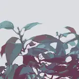
The leaves in the upper right of the image are in the foreground. If the leaves and the edge newsstand were merged together, the spatial relationship between the two would be unclear and they would be blurred together. I edited the leaves in the foreground to give them a more distinct shape.

Finally, the colors were fine-tuned again. As the first two pictures of the series of kites and balloons are highly saturated pictures, in order to make the third picture newsstand coordinate, I further enhanced the contrast of the saturation of the picture.

The illustration is now finished!
-
Hi guys :)
There is one thing I want to say about the text part of Behind the scenes and process.
I would like to reduce the current textual narrative and replace it with a more concise form. On the other hand, it also saves the time spent on writing each month's content while streamlining the reading time for everyone.
(After reading so much of my previous processes, you should be familiar with the general flow of my routine, and I think some basic stuff can be slightly omitted.)
As for how much more tailored it will be down the road—I will update one more process on "Stamps" this month, which will be shown in a more concise form for your reference.
The time saved will allow me to write other articles from time to time, such as some artists I studied or some targeted painting insights :P (If my graduate courses are too overwhelming, there may be a delay...)
Thank you for your support and understanding! Still sending thanks to my friend Valerie for helping me with the English translations.
See you in the next (condensed) version of the process!
Waiting
2023-03-14 03:23:54 +0000 UTCMilk Tea
2022-08-01 15:13:42 +0000 UTC