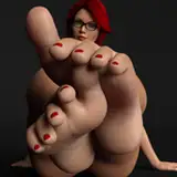
it's another month gone by, which means another cover for another R/L Monroe book! this one goes hard and sweaty and meaty, and the worldbuilding is both really funny and really fascinating in the little glimpse of it we get. and also there's three huge fuckin dudes going to town on each other. check it out, and follow along on the process for designing the cover below!
Trapped by a lethal boiling sun, in the neon ruins of a fallen supercity, three tank-grown ultrasoldiers have nothing to kill but time and no enemy but their own overheated flesh.
Daily hormone shots gave them hard bodies, but without a seedsucker to offer them relief, they soon have something even harder to contend with. It's not gay if you come out on top...right?
Almost 7k words(!), EPUB and PDF format.
Content:
M/M/M
straight turned gay
testosterone dosing
cum harvesting / drinking
dominance struggle
sexual hazing
rough sex

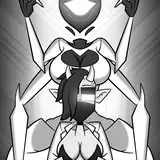
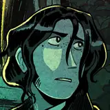
i lost track of the initial notes for these, but the first two were really just me spinning my wheels. my instinct was something with greek wrestling, stylized like pottery. we usually do the covers early in the month, so i hadn't read the finished book yet and didn't have a clear sense of the aesthetic yet. i did know there were three guys, which made composition tough. fighting is not, typically, a three-man's game. lee suggested looking at WWE and rugby

which led me to looking at turkish oil wrestling, because truly, what is greasier than that. this image ended up forming the basis of the third thumbnail, which, as you can probably guess, is what we went with. all i had to do was add an extra leg and bam, three greasy guys. easy! on to finishing the illustration!


so while we were talking about the color palette, lee brought up 80s splatterfest VHS cover design. we agreed on violent red and purple, but the topic of horror led me in a horror direction. gritty lines, harsh light and shadow, scary imagery with the single red eye, etc. and we agreed this look is Sick and Rules, but wasn't quite right for neon future climatepunk.
so i went back to the drawing board and totally got rid of the hatching. we're looking for neon, for black velvet, for graphic

definitely closer to the final product! though of course as soon as i saw it in discord i realized the purple on the middle guy's back and the third guy's leg were competing too much with the top guy's back and making it hard to know where to look. so: more variants

adding the paint strokes down was just something i wanted to try, and it was definitely the right move! there were like five more variations of just That with the gradient map very very slightly adjusted, but honestly it's not worth posting all of those lol. the version we settled with was the best one!
and that's the process for this month's fuck yourself friday cover! this is both my favorite cover so far AND my favorite story. i love high concept worldbuilding that serves the fucking. if you're here and supporting my work, i bet you do too! so go read it! it's only $3 dude!!