Happy Wednesday!
This feels like a small triumph, since I've been struggling to make progress on this. I think a lot of it will still get tweaked and I'm missing dialog bubbles all over the place--hope that I don't have to crush the art to make it fit, but I wanted to share some current work in progress pages!
Doing this makes me appreciate Gibson WAY more than I already did, there's a certain kind of mark making logic I'm going to have to get used to playing with, because it helps make sense of volume and form.

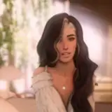
Something I'm really excited about learning from Gibson is playing light and dark areas against each other to create the illusion of lighting like he does so often. So for example something I'm starting to do in Eileen's hair above,having it surrounded by darkness but losing the outside contour line as it gets toward the peak can create this sense that it's illuminated and backlit from the windows behind her.
Gibson constantly switches it up between using contour lines to define forms when he wants a strong graphic outline, and then ignores them in other situations to create a kind sense of light and shadow.
It's as if outlines in his universe only exist where the viewer's eye is meant to focus and they disappear in what is intended to be out of focus. I'm hoping that by the later pages I can figure it out because I would love to do some fun things with lighting.
Check out the way he handles her the woman on the left's face and arm vs. her hands. The hand almost evaporates into hatch marks but it still has structure because of how he layers them and makes them break on changes in the direction of planes. All that isn't necessarily mind blowing but what IS mind blowing is the ridiculous amount of control he has over these marks. Such fine lines next to big calligraphic marks, it's stunning.

I'm going to try to not show his work next to my own in the future or else I'll feel very very very self conscious 😂
I'm finding it really challenging but interesting too, to draw focus the way he does. You have to control areas of light and dark so that the viewer's eye is naturally drawn where you want it to be through contrast, but there's the added challenge of controlling the density of mark making which is just another form of contrast, to create interest and focus.

This little peakaboo moment on Page 3 is one of those where I kept on adding and removing marks on her open crotch drawers so that they would feel light and cottony but trying to keep them textured enough that her butt peaking through could feel luminous.
What I'm saying is I still have a lot to learn. 😂
Thank you for supporting this process! ♥
Winton
Seb
2022-02-24 05:25:40 +0000 UTCWinton Kidd
2022-02-24 03:02:37 +0000 UTCRev. Zee
2022-02-24 01:28:31 +0000 UTCWinton Kidd
2022-02-23 22:54:19 +0000 UTCWinton Kidd
2022-02-23 22:48:52 +0000 UTCWuff_Boman
2022-02-23 22:40:49 +0000 UTCBowie Twombly
2022-02-23 22:28:47 +0000 UTC